library(tidyverse)
library(plotly)Students Performance Analysis
Looking at Student Performance
It’s been a while since I’ve sat down to practice using R and looking through data. So this is a chance for me to shake the rust off. I’m trying to write this summary as I go through the process to document my thoughts.
I started heading over to Kaggle and looked for any dataset I found interesting, I shortlisted a few and this one made the cut. I’ll get through the other datasets at some point.
There are a few reason I chose this set in particular. It’s availability was one for sure. But I’m also a recent graduate of the University of the West Indies. In a way, I still relate to being a student. Beyond that I think education is super important, especially for a people like Jamaica to improve and set themselves up. All this means I chose to take a crack at this dataset to get back into the groove.
Without further ado, let my load my trusty packages and get started.
Bringing in the Data
First I’ll bring in the data.
dataset<-read.csv("StudentsPerformance.csv")
glimpse(dataset)
Rows: 1,000
Columns: 8
$ gender <chr> "female", "female", "female", "male", "mal…
$ race.ethnicity <chr> "group B", "group C", "group B", "group A"…
$ parental.level.of.education <chr> "bachelor's degree", "some college", "mast…
$ lunch <chr> "standard", "standard", "standard", "free/…
$ test.preparation.course <chr> "none", "completed", "none", "none", "none…
$ math.score <int> 72, 69, 90, 47, 76, 71, 88, 40, 64, 38, 58…
$ reading.score <int> 72, 90, 95, 57, 78, 83, 95, 43, 64, 60, 54…
$ writing.score <int> 74, 88, 93, 44, 75, 78, 92, 39, 67, 50, 52…Alrighty. So we have 1000 rows, an OK size. We have a field for race, parental education level, lunch, whether they took a test preparation course, and then their math, reading and writing scores. I notice they have placeholders for the race field, likely to reduce any bias. It’s a good move in my opinion.
A few questions jump out at me:
- Do the different genders score differently?
- Do different Races score differently?
- Does taking the test prep course make a difference?
- Are Reading and Writing Scores more closely related than Math?
Of these, I’m actually most curious about the last one, so let me work through them all.
Do the Genders Score Differently
There should be a couple ways to do this. We can carry out a 2 sample t-test.
dataset<- dataset |> mutate( mean.score = (reading.score + writing.score + math.score)/3)
gender.t.test<-t.test(mean.score ~ gender, data = dataset, var.equal = FALSE)
print(gender.t.test)
    Welch Two Sample t-test

data:  mean.score by gender
t = 4.1789, df = 997.85, p-value = 3.186e-05
alternative hypothesis: true difference in means between group female and group male is not equal to 0
95 percent confidence interval:
 1.979515 5.484516
sample estimates:
mean in group female   mean in group male
            69.56950             65.83748
According to this, the female mean score is higher than the male mean score. The difference is statistically significant.
I could also do an Analysis of Variance (ANOVA)
gender.anova<-aov(mean.score ~ gender, data = dataset)
print(summary(gender.anova))
Df Sum Sq Mean Sq F value Pr(>F)
gender 1 3477 3477 17.39 3.31e-05 ***
Residuals 998 199591 200
---
Signif. codes: 0 '***' 0.001 '**' 0.01 '*' 0.05 '.' 0.1 ' ' 1Both agree, there a statistically significant difference between the mean score of the male and female students. The p-value, or chance that these results are due to chance, is WAY less than 5%. At this sample size, I’d put some stock behind it.
In all honesty, I’d love to go through by Math, Reading and Writing to see if one particular subject has a bigger impact than the others.
Does Race make a difference?
The next one is a touchy topic. Thankfully the racial groups are designated with identifiers. I haven’t checked for the Key at the time of writing. A similar test can be be done. in this case an ANOVA is used to test the impact of race.
race.anova<-aov(mean.score ~ race.ethnicity, data = dataset)
print(summary(race.anova))
Df Sum Sq Mean Sq F value Pr(>F)
race.ethnicity 4 7164 1790.9 9.096 3.23e-07 ***
Residuals 995 195904 196.9
---
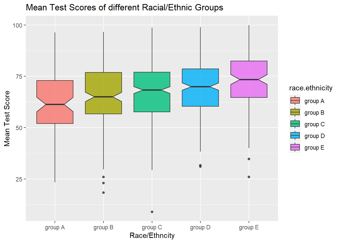
Signif. codes: 0 '***' 0.001 '**' 0.01 '*' 0.05 '.' 0.1 ' ' 1Once again the results are statistically significant. Now I could do something boring and bring up the mean mean score for each group like so:
d<-dataset |> group_by(race.ethnicity) |> summarise(race.mean = mean(mean.score))
print(d)
# A tibble: 5 × 2
race.ethnicity race.mean
<chr> <dbl>
1 group A 63.0
2 group B 65.5
3 group C 67.1
4 group D 69.2
5 group E 72.8But I find it may be better to do this graphically. There’s different ways to do this, but box plots are a good way to go. This plot shows the means of each racial group, but also an idea of how widely spread the scores are for each. For example, it lets you know that Race D has the second highest mean test score, but also that scores in this race are the closest together, with less variation/spread.

Test Prep Course
The test prep course follows a similar analysis. The reason being that, for the purpose of this exercise, race, gender and whether the student did a test prep course are categorical variables. Students neatly fall into discrete groups.
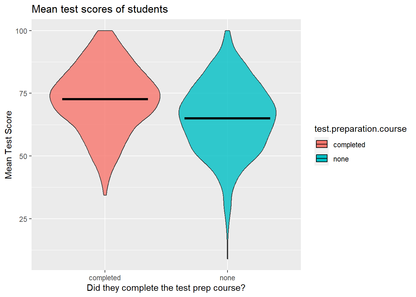
In fact lets approach this one a little differently. Let’s look at it graphically first. A lot of times that’s better for intuition.
test.score.scatter<-dataset |> ggplot(mapping = aes(x = test.preparation.course, y = mean.score, fill = test.preparation.course))+
  geom_violin(alpha= 0.8, show.legend = FALSE)+
  stat_summary(fun = "mean", geom = "crossbar", color = "black", width = 0.7)+
  labs(title = "Mean test scores of students")+
  xlab("Did they complete the test prep course?")+
  ylab("Mean Test Score")
test.score.scatter
From looking, you can already get a sense that those who did the prep course generally did better. More of those students had higher scores. The lower performing students of the group also performed better than the low performers who didn’t do the course. If you are less comfortable eyeballing it (and checking is always good), we can calculate the p-value with an ANOVA as above.
test.prep.aov<-aov(mean.score~test.preparation.course, data = dataset)
print(summary(test.prep.aov))
Df Sum Sq Mean Sq F value Pr(>F)
test.preparation.course 1 13382 13382 70.41 <2e-16 ***
Residuals 998 189686 190
---
Signif. codes: 0 '***' 0.001 '**' 0.01 '*' 0.05 '.' 0.1 ' ' 1In my head, I’m curious to know whether this test prep course is paid for or if there are other entrance requirements. At any rate: the difference is once again statistically significant.
Reading and Writing
Now its time for the final question. This is actually the one I’m most curious about. Are reading and writing scores more closely related than math? To me, reading and writing feel like two sides of a coin. Math seems a little further away, so I’ll see what the data says.
library(ggcorrplot)
test.scores<-dataset[,c(6:8)]
corr.matrix<-cor(test.scores)
print(corr.matrix)
math.score reading.score writing.score
math.score 1.0000000 0.8175797 0.8026420
reading.score 0.8175797 1.0000000 0.9545981
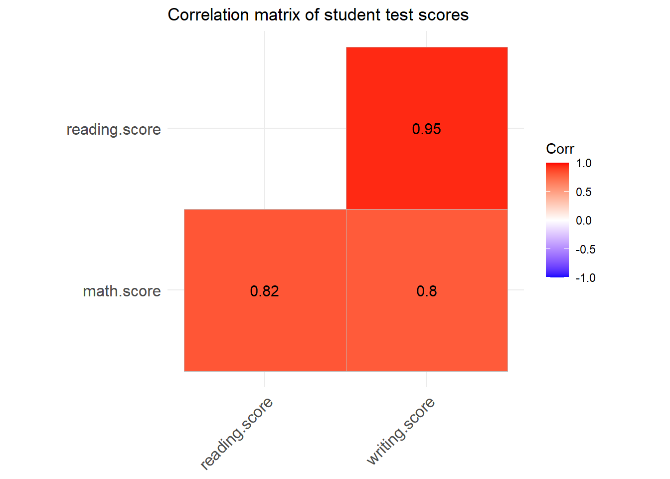
writing.score 0.8026420 0.9545981 1.0000000But everyone loves graphs. So we’ll visualise it to tell a better story.
cplot<-ggcorrplot(corr.matrix, method = "square", type = "lower", lab = TRUE, title = "Correlation matrix of student test scores")
cplot
The “redness” indicates closer relationships, as do the higher numbers. To an extent I was right. All the scores are strongly correlated. In other words students who scored one way in say, math would tend to score similarly in reading and writing. However, reading and writing were more strongly correlated than either was to math. Which is about what I assumed.
Final Thoughts
This was a good exercise to brush off the dust as far as getting back into my groove with R and analysing data. I genuinely think being able to understand statistics and data is important. While there are people who make this their whole career, I don’t think I’m there yet.
I do think, career applications aside, I can get more use out of this. As a former lecturer of mine once repeated, “There’s lies, damn lies, and statistics” and a little understanding should help peel back some of those lies. For example, I could have hid a lot in mean score, especially if it turned out the scores weren’t highly correlated. There are still more questions that these questions unearthed.
But even so, I think fostering a mindset of having questions, and knowing how to start finding the answers is important. Lets hope I stick to learning and improving that aspect of my mind and skillset.